Who should get the ad?
A 14-million-user randomized advertising experiment, taken apart properly: verify the randomization, adjust the estimate, model individual uplift — and find that 10% of users carry 64% of the entire campaign’s effect.
The Criteo uplift dataset is one of the few public records of a real, large-scale randomized experiment: 13.98 million users, an 85/15 treatment/control split, and two outcomes (site visit, conversion). Most A/B-test writeups start at "the p-value was..." This one starts earlier, because an experiment you haven't audited is a rumor.
Step 1: trust, but verify
The assignment ratio matched the documented design exactly (85.0000% — so exactly it reveals the public file was subsampled to hit it). The covariate balance was more interesting: 8 of 12 user features differ across arms by standardized mean differences of 0.01–0.05. Every conventional checklist calls that "fine" (the usual threshold is 0.1). But with 14 million users those differences are statistically unambiguous — and they turn out to matter.
Step 2: the readout, naive vs. adjusted
The naive difference in means says the ads lift conversion by +0.115pp on a 0.194% base. A doubly-robust estimate (AIPW with the known randomization propensity and per-arm outcome models) says +0.100pp — the "fine" covariate imbalance was inflating the naive estimate by roughly 13%, and by 25% on the visit outcome. Adjustment also cut the variance by 11–25%, for free. Two other numbers a readout should always include: the design's minimum detectable effect (4.8% relative on conversion — this experiment was big enough for its question), and the exposure rate — only 3.6% of treated users ever actually saw an ad, so all effects here are intent-to-treat, and per-reached-user effects are far larger.
Step 3: from "does it work" to "for whom"
A T-learner (separate LightGBM models for the treated and control response, uplift = the difference) was trained on 70% of users and validated on the untouched 30% — where, because assignment is randomized, each score decile's actual treatment effect can be measured directly. The ranking is real: measured uplift in the top decile is +79 conversions per 10,000 users, ~20× the population average.
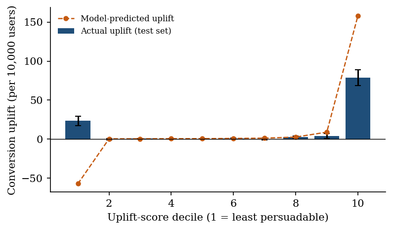
The decile chart also contains the project's most instructive failure: the model predicts negative uplift for its bottom decile — "sleeping dogs" the ad would supposedly repel. The held-out data disagrees: those users respond mildly positively (+23/10k, confidence interval excluding zero). That's a known T-learner artifact at the extremes of the score distribution, and it comes with a policy warning: use this model to prioritize, never to blacklist.
Step 4: the payoff
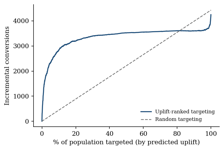
The Qini curve converts the ranking into money: targeting the top 10% of users by predicted uplift captures 64% of everything the full campaign achieves — 6.4× the incremental conversions per impression. The top 30% keeps 77% at 2.6× efficiency. The one-page recommendation memo puts that in marketing-leadership language, artifact warning included.
Disclosed, not buried
- The model over-predicts uplift magnitude ~2× at the top; the ranking validates, the calibration doesn't. Rank with it, don't forecast with it.
- All effects are intent-to-treat under 3.6% exposure; reach, not persuasion, may be the binding constraint.
- The policy numbers come from one held-out split of one experiment; the memo's recommended next step is a production pilot with its own holdout, not a rollout.